Windows 10 has optimized controls for touch, mouse and keyboard across the Windows 10 Device families. Some of these controls have come from old, such as the Pivot control from the phone, however, there are some new controls too - the SplitView and RelativePanel - and this post is going to show you how to create a basic responsive UWP application utilizing these new controls. So sit back, relax and enjoy!
SplitView
The SplitView Control, often referred to as the "Hamburger Control", is a navigation control which can adapt its design to optimize the screen real estate for content. Below you can see the various states of the control by setting properties DisplayMode and IsPaneOpen.
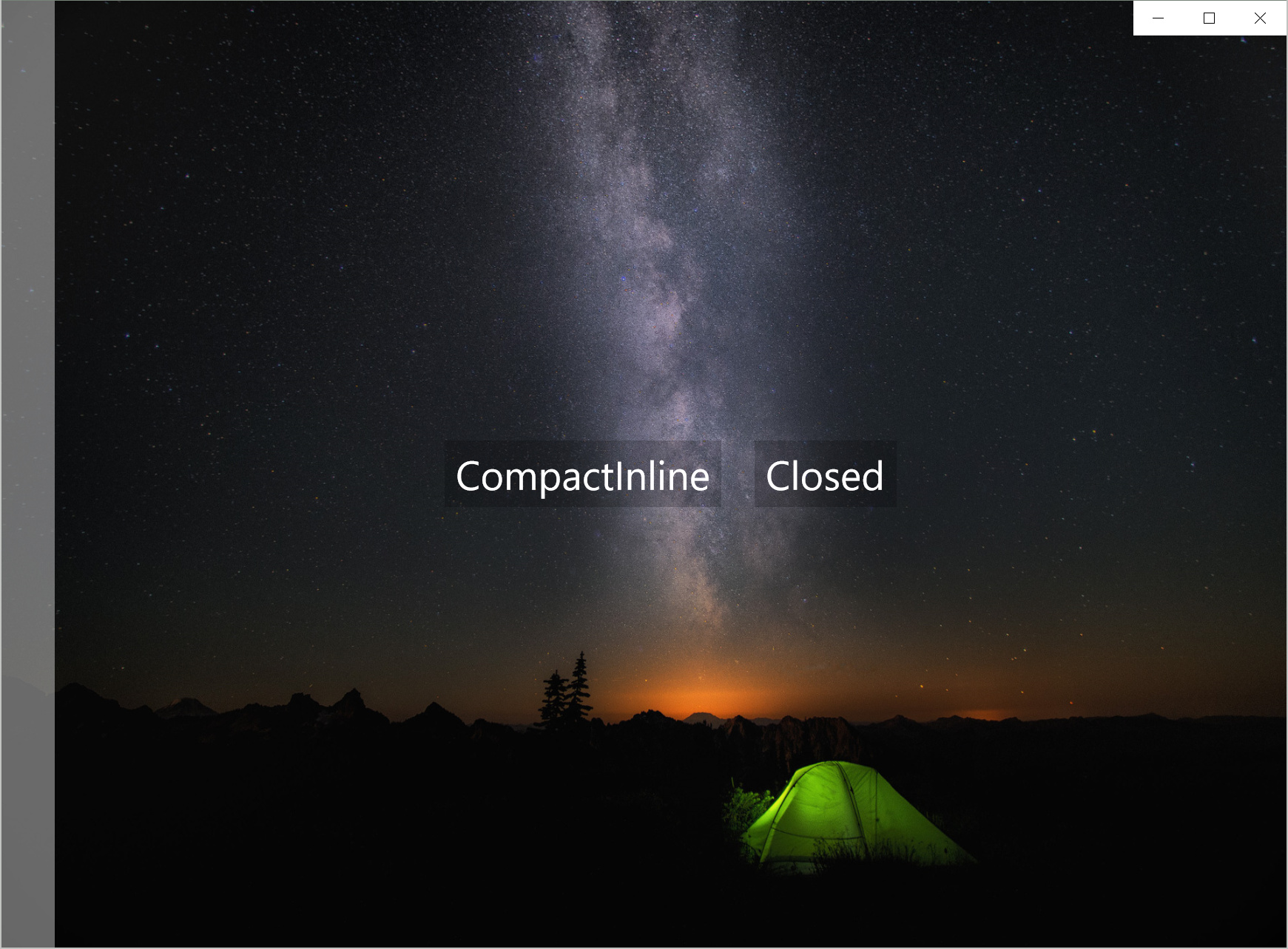

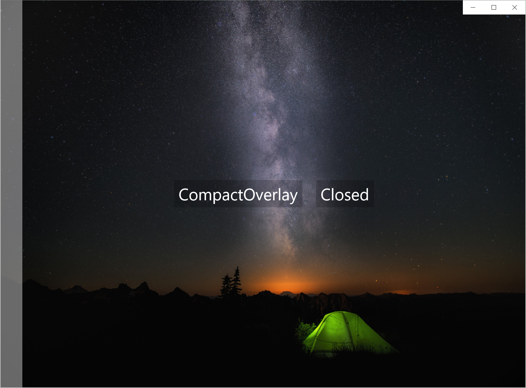


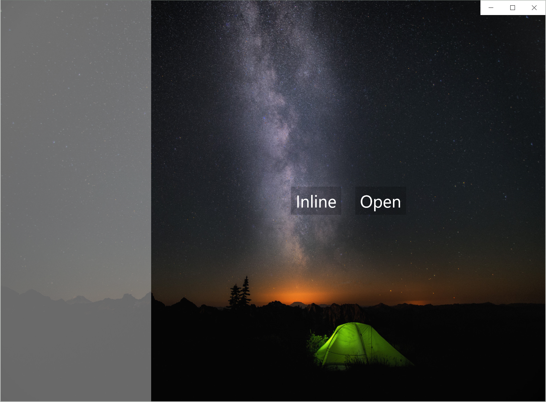
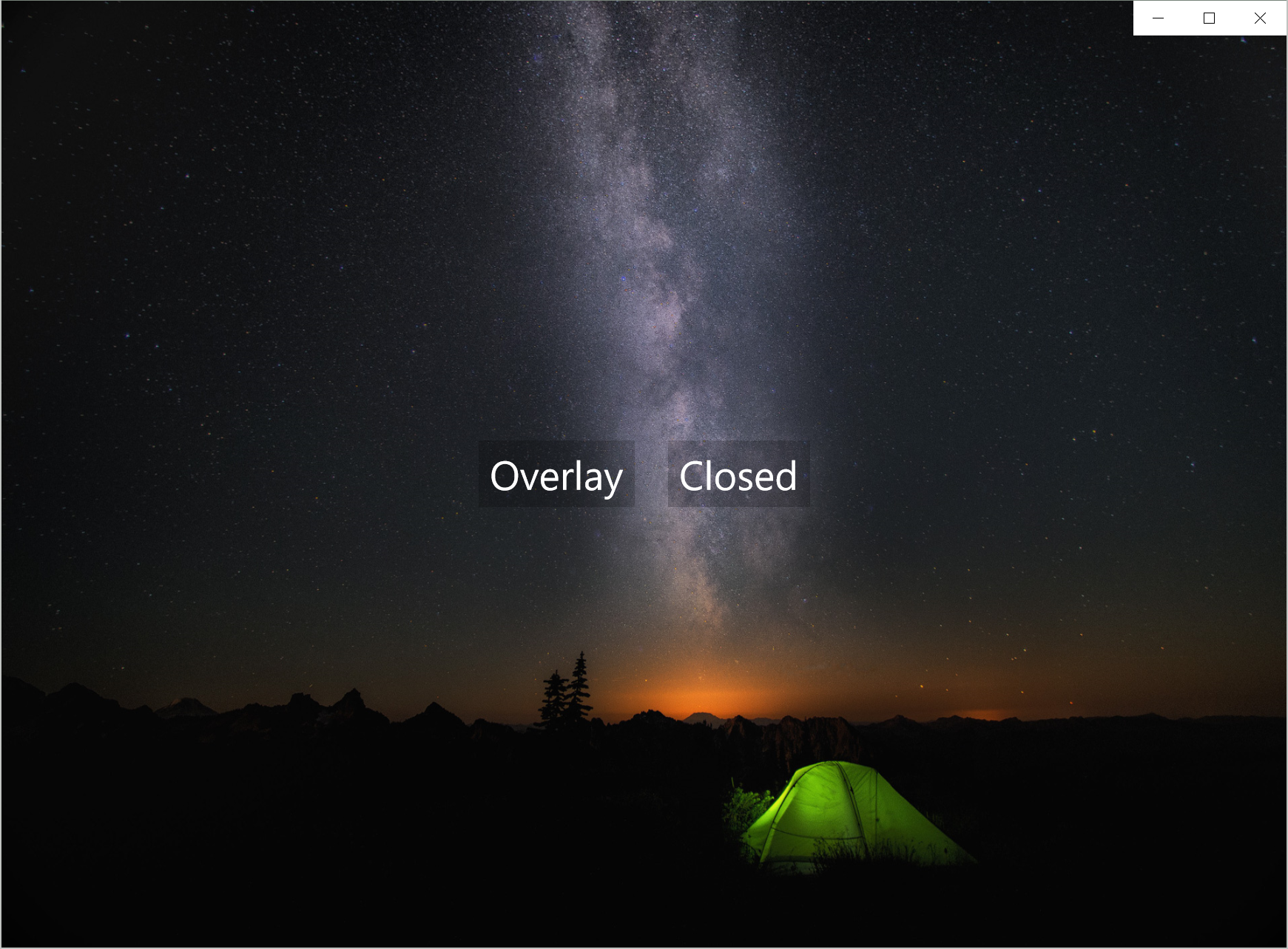
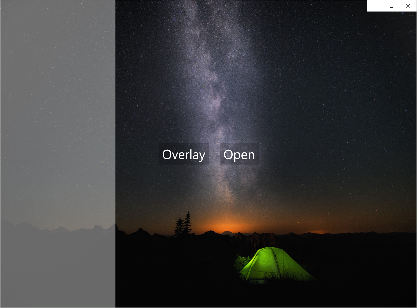
Note that anything with an Overlay DisplayMode will automatically close when it loses focus.
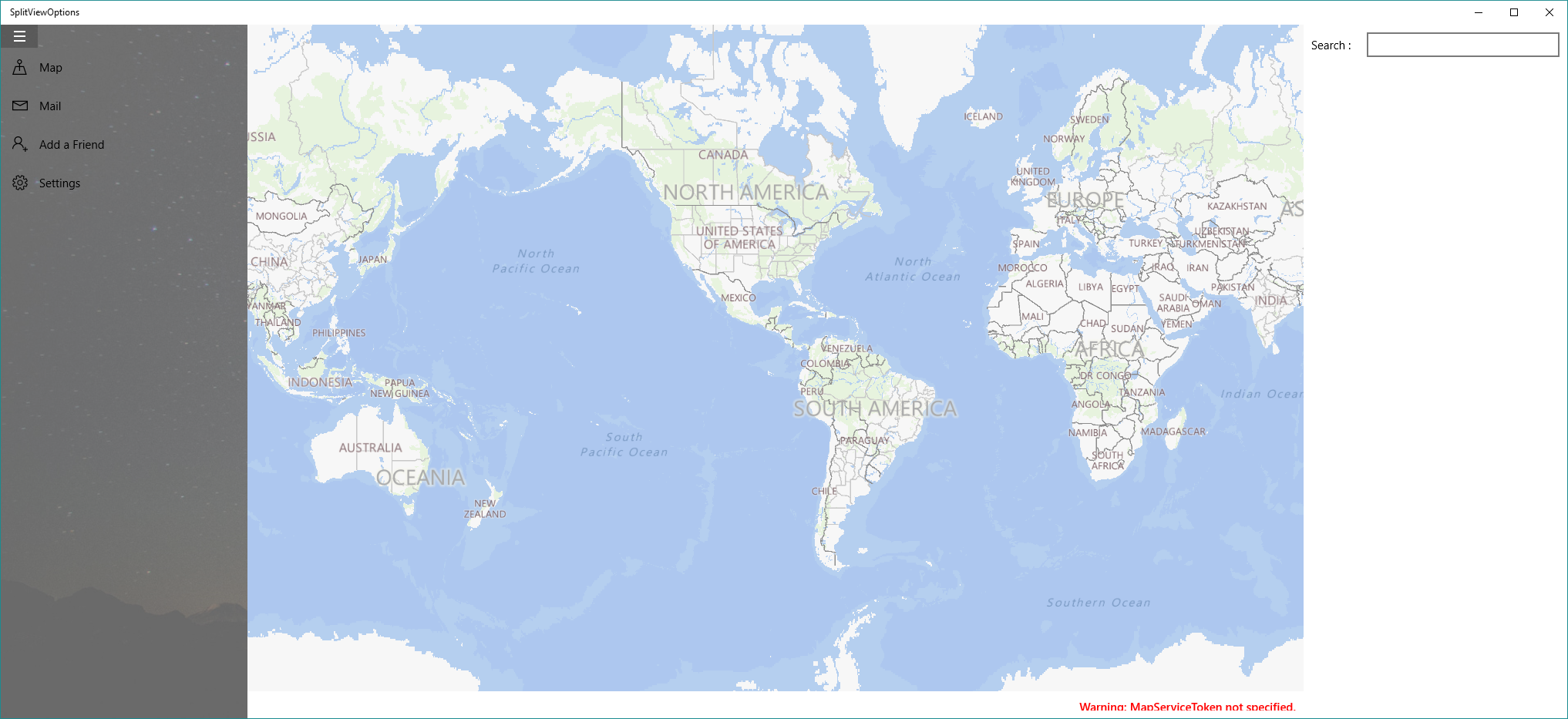
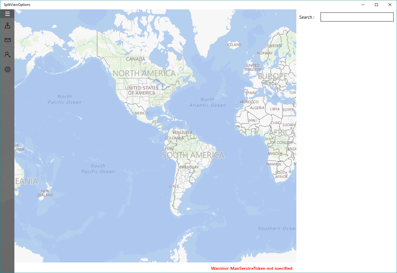
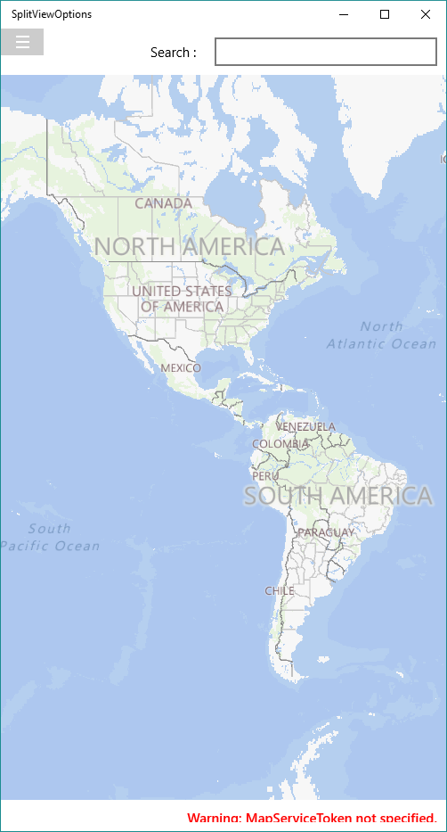
Now you know the various options, let me show you how to create something simple with navigation like the application below.
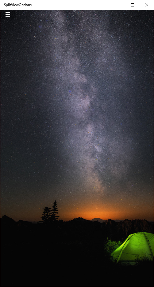
Just for demonstration purposes I've put a background on the SplitView, as we go through the application in it's various states it'll help you see what happens as it's transitions between states, but, for coding simplicity, I will not show this code.
Let's get started, first I need add a SplitView control to the MainPage.xaml with the DisplayMode and IsPaneOpen properties set so we can see what's going on.
<SplitView x:Name="MySplitView" DisplayMode="Inline" IsPaneOpen="True">
</SplitView>
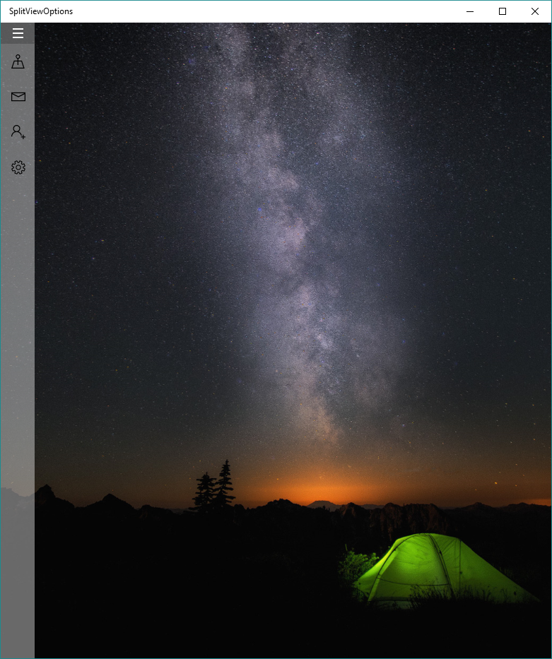
Now to add the Navigation Menu Items to the Pane - I like to use RadioButtons because of the visual states it offers.
<SplitView x:Name="MySplitView" DisplayMode="Inline" IsPaneOpen="True">
    <SplitView.Pane>
        <StackPanel Margin="0,30,0,0">
            <RadioButton>
                <StackPanel Orientation="Horizontal">
                    <SymbolIcon Symbol="Map" />
                    <TextBlock Text="Map" Margin="15,0,0,0" />
                </StackPanel>
            </RadioButton>
            <RadioButton>
                <StackPanel Orientation="Horizontal">
                    <SymbolIcon Symbol="Mail" />
                    <TextBlock Text="Mail" Margin="15,0,0,0" />
                </StackPanel>
            </RadioButton>
            <RadioButton>
                <StackPanel Orientation="Horizontal">
                    <SymbolIcon Symbol="AddFriend" />
                    <TextBlock Text="Add a Friend" Margin="15,0,0,0" />
                </StackPanel>
            </RadioButton>
            <RadioButton>
                <StackPanel Orientation="Horizontal">
                    <SymbolIcon Symbol="Setting" />
                    <TextBlock Text="Settings" Margin="15,0,0,0" />
                </StackPanel>
            </RadioButton>
        </StackPanel>
    </SplitView.Pane>
</SplitView>
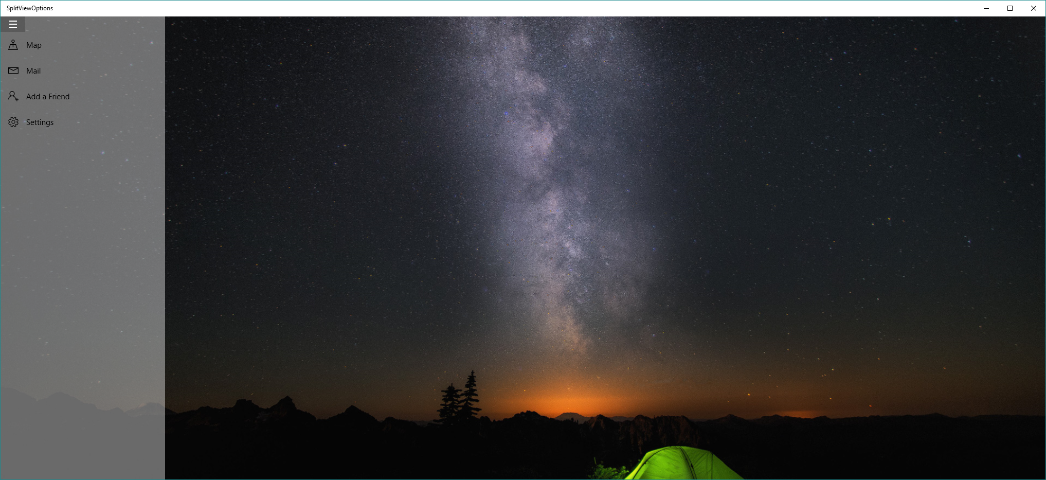
As we are using the RadioButton, I also need to change the default style so I add a little styling code to the App.xaml
<Application.Resources>
      <ResourceDictionary>
            <Style TargetType="RadioButton">
                  <Setter Property="Template">
                  <Setter.Value>
                  <ControlTemplate>
                  <ContentPresenter Margin="15" />
                  </ControlTemplate>
                  </Setter.Value>
                  </Setter>
            </Style>
      </ResourceDictionary>
</Application.Resources>
The SplitView, by default does not come with a Hamburger icon, so let's create one. I like to use Rectangles, but some people like to use a font symbol from Segoe MDL2, the choice is yours. I place this code under the SplitView
<Button x:Name="HamburgerButton"
        Width="{Binding ElementName=MySplitView, Path=CompactPaneLength}"
        VerticalAlignment="Top"
        Click="HamburgerButton_Click">
    <StackPanel>
        <Rectangle Width="15" Height="2" Margin="2" Fill="White" />
        <Rectangle Width="15" Height="2" Margin="2" Fill="White" />
        <Rectangle Width="15" Height="2" Margin="2" Fill="White" />
    </StackPanel>
</Button>
To ensure the SplitView is toggled I need to add the following code behind for the Clicked event:
private void HamburgerButton_Click(object sender, RoutedEventArgs e)
{
	this.MySplitView.IsPaneOpen = this.MySplitView.IsPaneOpen ? false : true;
}
Now I need to add a place for the content, for this I will add a Frame. Whenever a user clicks on a radio button is should change the content of the Frame.
<SplitView x:Name="MySplitView" DisplayMode="Inline" IsPaneOpen="True">
    <SplitView.Pane[...]/>
    <Frame x:Name="MainFrame" />
</SplitView>
Now I have the basic user interface created, I need to wire up the navigation.
<RadioButton Tag="Map" Click="RadioButtonPaneItem_Click">
    <StackPanel Orientation="Horizontal">
        <SymbolIcon Symbol="Map" />
        <TextBlock Text="Map" Margin="15,0,0,0" />
    </StackPanel>
</RadioButton>
<RadioButton Tag="Mail" Click="RadioButtonPaneItem_Click">
    <StackPanel Orientation="Horizontal">
        <SymbolIcon Symbol="Mail" />
        <TextBlock Text="Mail" Margin="15,0,0,0" />
    </StackPanel>
</RadioButton>
<RadioButton Tag="AddFriend" Click="RadioButtonPaneItem_Click">
    <StackPanel Orientation="Horizontal">
        <SymbolIcon Symbol="AddFriend" />
        <TextBlock Text="Add a Friend" Margin="15,0,0,0" />
    </StackPanel>
</RadioButton>
<RadioButton Tag="Settings" Click="RadioButtonPaneItem_Click">
    <StackPanel Orientation="Horizontal">
        <SymbolIcon Symbol="Setting" />
        <TextBlock Text="Settings" Margin="15,0,0,0" />
    </StackPanel>
</RadioButton>
For each RadioButton I created previously, I set the Tag property to identify it, and then I wire it up to the same event handler. You could have an event handler for each button, but when it's this simple, I prefer this approach.
private void RadioButtonPaneItem_Click(object sender, RoutedEventArgs e)
{
	var radioButton = sender as RadioButton;

	if (radioButton != null)
	{
		switch (radioButton.Tag.ToString())
		{
			case "Map":
				this.MainFrame.Navigate(typeof(MapPage));
				break;
		}
	}
}
The C# code checks the Tag to determine which page to load as content into the Frame. I call the Navigate method on the Frame, passing in the page to load.
We aren't finished though, by default the SplitView control will not change size auto-magically. To change the state of the SplitView based upon the size of the application I will use AdaptiveTriggers, a new trigger in Windows 10.
Visual State Manager and Adaptive Triggers
The Visual State Manager is now more important in Windows 10 than ever. The Visual State Manager is the key to making sure that applications have a responsive design. I will use AdapativeTriggers to determine the state of the SplitView in relation to the application window width.
First I need to add the Visual State Manager to SplitView and define the various states - Narrow, Compact and Wide. As you can see I place the states before the SplitView but still within the root Grid.
In each state I define a trigger, I am going to use a new trigger called an AdapativeTrigger. An AdaptiveTrigger uses the application width and/or height to determine when a trigger should be active - below you can see I set the MinWindowWidth on the Narrow state to 0px, the Compact state to 720px and Wide state to 1920px.
When a state is triggered I need to tell the application what to do, to do this I set the Setters property on the VisualState - in this case it's the DisplayMode and IsPaneOpen property.
    <Grid Background="{ThemeResource ApplicationPageBackgroundThemeBrush}">
        <VisualStateManager.VisualStateGroups>
            <VisualStateGroup>
                <VisualState x:Name="Narrow">
                    <VisualState.StateTriggers>
                        <AdaptiveTrigger MinWindowWidth="0" />
                    </VisualState.StateTriggers>
                    <VisualState.Setters>
                        <Setter Target="MySplitView.DisplayMode"
                                Value="Overlay" />
                        <Setter Target="MySplitView.IsPaneOpen"
                                Value="False" />
                    </VisualState.Setters>
                </VisualState>
                <VisualState x:Name="Compact">
                    <VisualState.StateTriggers>
                        <AdaptiveTrigger MinWindowWidth="720" />
                    </VisualState.StateTriggers>
                    <VisualState.Setters>
                        <Setter Target="MySplitView.DisplayMode"
                                Value="CompactOverlay" />
                        <Setter Target="MySplitView.IsPaneOpen"
                                Value="False" />
                    </VisualState.Setters>
                </VisualState>
                <VisualState x:Name="Wide">
                    <VisualState.StateTriggers>
                        <AdaptiveTrigger MinWindowWidth="1920"/>
                    </VisualState.StateTriggers>
                    <VisualState.Setters>
                        <Setter Target="MySplitView.DisplayMode"
                                Value="CompactInline" />
                        <Setter Target="MySplitView.IsPaneOpen"
                                Value="True" />
                    </VisualState.Setters>
                </VisualState>
            </VisualStateGroup>
        </VisualStateManager.VisualStateGroups>
      <SplitView[...]/>
</Grid>
RelativePanel
As the name suggests the RelativePanel control allows you to layout UIElements relative to one another.
Let's go to the new Map Page I loaded into the Frame, add a RelativePanel and add a few controls to the Page.
<Grid Background="{ThemeResource ApplicationPageBackgroundThemeBrush}">
  <RelativePanel>
    <StackPanel x:Name="SearchControls" Orientation="Horizontal">
      <TextBlock Text="Search :"
                 VerticalAlignment="Center"
                 Margin="10" />
      <TextBox Width="250"
               VerticalAlignment="Center"
               Margin="10" />
    </StackPanel>
    <maps:MapControl x:Name="MapControl" />
  </RelativePanel>
</Grid>
I use the RelativePanel Attached Properties on the UIElements to ensure the layout is correct. In this case the map control has the RelativePanel properties set to it for AlignBottonWithPanel and AlignLeftWithPanel. You can define other properties too where you can set if the UIElement should be LeftOf, RightOf, Above or Below another UIElement.
<Grid Background="{ThemeResource ApplicationPageBackgroundThemeBrush}">
  <RelativePanel>
    <StackPanel x:Name="SearchControls" Orientation="Horizontal">
      <TextBlock Text="Search :"
                 VerticalAlignment="Center"
                 Margin="10" />
      <TextBox Width="250"
               VerticalAlignment="Center"
               Margin="10" />
    </StackPanel>
    <maps:MapControl x:Name="MapControl"
                     RelativePanel.AlignBottomWithPanel="True"
                     RelativePanel.AlignLeftWithPanel="True" />
  </RelativePanel>
</Grid>
When the application is resized, the content does not reflow to optimize for the screen size. To ensure the content does reflow, we need to use the Visual State Manager with Adaptive Triggers - spotting a theme here? I also use some of the other mentioned attached properties on the RelativePanel when changing state.
Note, that in this case I only have 2 states, by choice, it doesn't have to match the Main Page.
<Grid Background="{ThemeResource ApplicationPageBackgroundThemeBrush}">
  <VisualStateManager.VisualStateGroups>
    <VisualStateGroup>
      <VisualState x:Name="Narrow">
        <VisualState.StateTriggers>
          <AdaptiveTrigger MinWindowWidth="0" />
        </VisualState.StateTriggers>
        <VisualState.Setters>
          <Setter Target="SearchControls.(RelativePanel.AlignRightWithPanel)"
                  Value="True"/>
          <Setter Target="MapControl.(RelativePanel.Below)"
                  Value="SearchControls" />
          <Setter Target="MapControl.(RelativePanel.AlignRightWithPanel)"
                  Value="True" />
        </VisualState.Setters>
      </VisualState>
      <VisualState x:Name="Wide">
        <VisualState.StateTriggers>
          <AdaptiveTrigger MinWindowWidth="720" />
        </VisualState.StateTriggers>
        <VisualState.Setters>
          <Setter Target="SearchControls.(RelativePanel.AlignRightWithPanel)"
                  Value="True"/>
          <Setter Target="MapControl.(RelativePanel.AlignTopWithPanel)"
                  Value="True" />
          <Setter Target="MapControl.(RelativePanel.LeftOf)"
                  Value="SearchControls" />
        </VisualState.Setters>
      </VisualState>
    </VisualStateGroup>
  </VisualStateManager.VisualStateGroups>
  <RelativePanel>
    <StackPanel x:Name="SearchControls" Orientation="Horizontal">
      <TextBlock Text="Search :" VerticalAlignment="Center" Margin="10" />
      <TextBox Width="250" VerticalAlignment="Center" Margin="10" />
    </StackPanel>
    <maps:MapControl x:Name="MapControl"
                     RelativePanel.AlignBottomWithPanel="True"
                     RelativePanel.AlignLeftWithPanel="True" />
  </RelativePanel>
</Grid>
When we resize the application you can see that everything remains responsive.
Summary
This is ajammed packed post where I've briefly shown the SplitView control and the RelativePanel twinned with Visual State Manager using Adaptive Triggers. I hope you found this post useful.
For source go to https://github.com/shenchauhan/blog
Channel 9 video: https://channel9.msdn.com/Shows/Inside-Windows-Platform/UWP-Layout-using-SplitView-and-RelativePanel-in-C-with-XAML
In the meantime Happy Coding!